Up
Back
Back
About me
Resume
Contacts
Reimagining the Public Service app's booking flow
Reimagining the Public Service app's booking flow
Reimagining the Public Service app's booking flow
September 2024
September 2024
Prototype
My role
UX/UI Designer
My role
UX/UI Designer
Team
1 UX/UI Designer (me)
1 Frontend Developer
1 Product Owner
Team
1 UX/UI Designer (me)
1 Frontend Developer
1 Product Owner
Timeline
2 weeks
September 2024
Timeline
2 weeks
September 2024
Prototype
Prototype
This case study explores how I enhanced Kazakhstan's PSC government services app by completely redesigning its booking flow. Facing critical usability issues and working with tight constraints, 2 weeks and no research budget, I delivered a streamlined solution that transformed a confusing, multi-step process into an intuitive experience with clear navigation, visual hierarchy, and supportive elements.
The redesign focused on making government services more accessible through improved button prominence, simplified city/branch selection, clearer service descriptions, and an intuitive date/time picker—all validated through lean UX methods and competitive analysis.
What is PSC?
What is PSC?
PSС, a public service app designed to streamline queue bookings for Kazakhstan residents, faced growing pains as its user base expanded. The original version, rushed to meet tight deadlines, struggled to meet evolving needs, leaving users frustrated with confusing navigation, unclear labels, and inadequate error prevention.
Determined to enhance the experience, I took on the task of simplifying the app. My focus was on tackling these pain points head-on, crafting a more intuitive and user-friendly interface to empower users and reduce frustration.
Understanding users' pain points
Understanding users' pain points
First of all, with no budget for in-depth research and only two weeks to redesign the PSС app’s flow, I adopted a lean approach to efficiently uncover user pain points.
To better understand the current problems, I conducted a quick heuristic evaluation of the existing booking experience, identifying potential friction points, such as confusing navigation and unclear labels.
To gain real insights, I spoke with the head of the front office, a key stakeholder who observes user struggles daily. This concise yet insightful conversation confirmed my assumptions and uncovered additional user challenges. Here is key insights:
Main JTBD not defined*
There was no clear hierarchy. The primary Job to Be Done (“Get a Ticket”) was not clearly highlighted, so users often overlooked the main action. Competing interface elements and unclear labels made it harder to identify.
Services aren’t clear to regular users
People without prior experience using government services struggle to understand the meaning of labels. Which leads many users to reach out to front office staff for extra help.
Unclear user flow
In most UX-driven platforms, booking flows are broken down into 3 clear steps, often supported by a progress indicator to guide the user. In contrast, the PSC app lacks both, making the flow feel long and hard to follow.
Outdated design
Inconsistent styling, visual clutter, and poor spacing make it harder to focus on key actions. In addition, the colour palette didn’t meet accessibility standards (WCAG), which impacted readability.
First of all, with no budget for in-depth research and only two weeks to redesign the PSС app’s flow, I adopted a lean approach to efficiently uncover user pain points.
To better understand the current problems, I conducted a quick heuristic evaluation of the existing booking experience, identifying potential friction points, such as confusing navigation and unclear labels.
To gain real insights, I spoke with the head of the front office, a key stakeholder who observes user struggles daily. This concise yet insightful conversation confirmed my assumptions and uncovered additional user challenges. Here is key insights:
Main JTBD not defined*
There was no clear hierarchy. The primary Job to Be Done (“Get a Ticket”) was not clearly highlighted, so users often overlooked the main action. Competing interface elements and unclear labels made it harder to identify
Services aren’t clear to regular users
People without prior experience using government services struggle to understand the meaning of labels. Which leads many users to reach out to front office staff for extra help.
Unclear user flow
In most UX-driven platforms, booking flows are broken down into 3 clear steps, often supported by a progress indicator to guide the user. In contrast, the PSC app lacks both, making the flow feel long and hard to follow.
Outdated design
Inconsistent styling, visual clutter, and poor spacing make it harder to focus on key actions. In addition, the colour palette didn’t meet accessibility standards (WCAG), which impacted readability.
Competitive analysis
Competitive analysis
Furthermore, to better understand how user-friendly apps structure their flows, I reviewed different systems and analyzed best practices across both public and private services, including government platforms, banking apps, and e-commerce tools.
My goal was to identify design patterns that reduce cognitive load and support a smoother, more intuitive user experience.
Contextual descriptions
To ensure users understand labels and actions, apps provide short, supportive descriptions under key elements. This approach improves clarity, especially for unfamiliar terms or complex processes.
Prominent primary actions
In most UX-driven platforms, booking flows are broken down into 3 clear steps, often supported by a progress indicator to guide the user. In contrast, the PSC app lacks both, making the flow feel long and hard to follow.
Clear progress indication
Linear flows like sign-up or checkout typically follow 3-4 clear steps with progress bars showing users their current position and remaining tasks, helping reduce cognitive overwhelm.
Design solutions:
Home screen redesign
Design solutions:
Home screen redesign
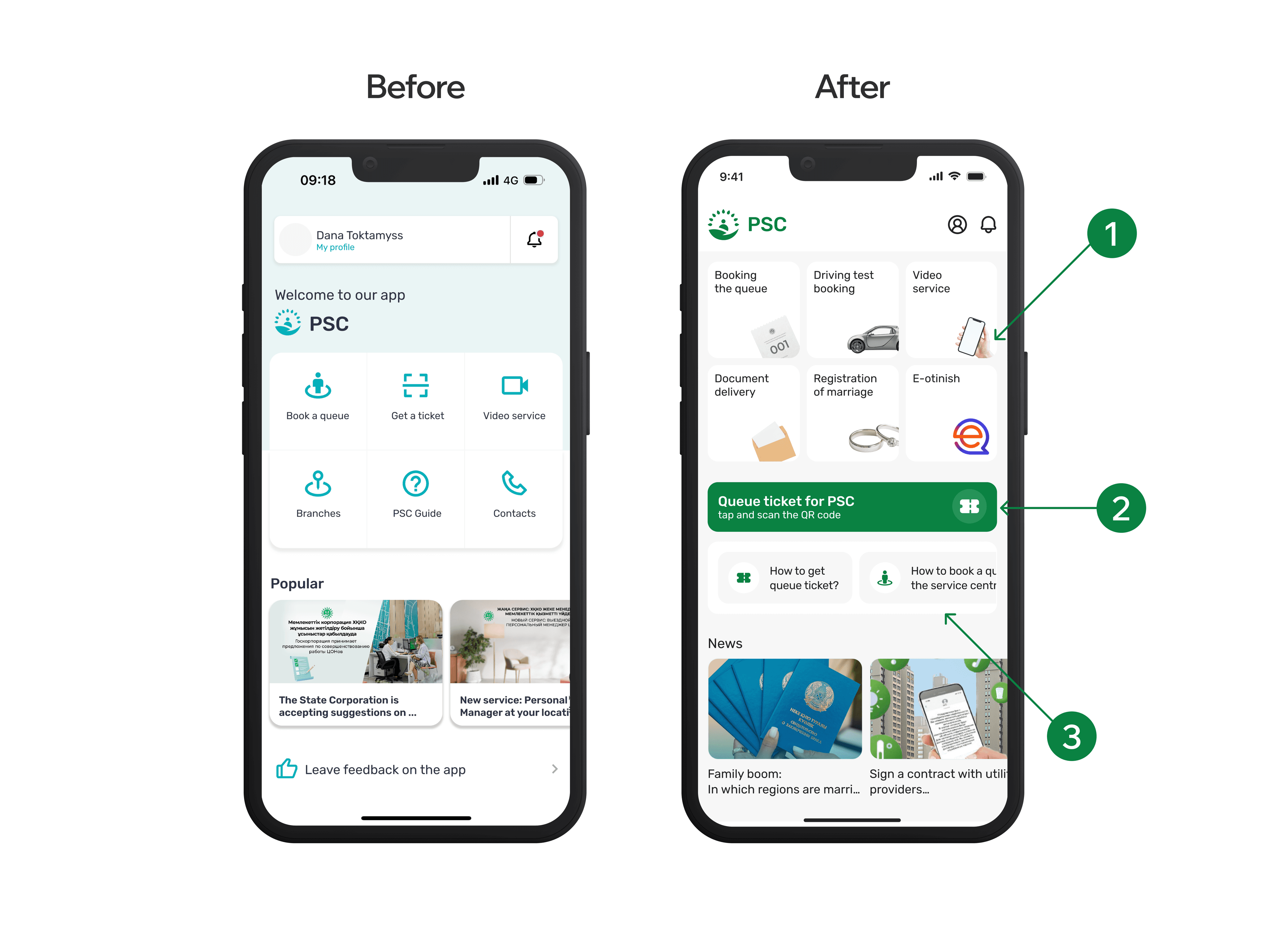
To enhance the PSC app’s user experience, I tackled the main screen, which lacked clarity for first-time users.
I redesigned the interface with simple illustrations and contextual tips to make navigation more intuitive for new users.
The "Get a Ticket" button was previously hard to locate, so I transformed it into a prominent green primary button. I refined the label to be clearer and more descriptive, while adding a ticket icon for better visibility and instant recognition.
Based on feedback from front office managers—who mentioned they frequently help users book appointments manually—I added helpful tips specifically designed for first-time users to reduce their dependency on staff assistance.
I improved the entire layout with better spacing, simplified navigation, and a cleaner visual hierarchy. The green accent color aligns with the organization's recent rebranding, creating a more cohesive and professional appearance.
Design solutions:
Simplifying booking flow
Design solutions:
Simplifying booking flow
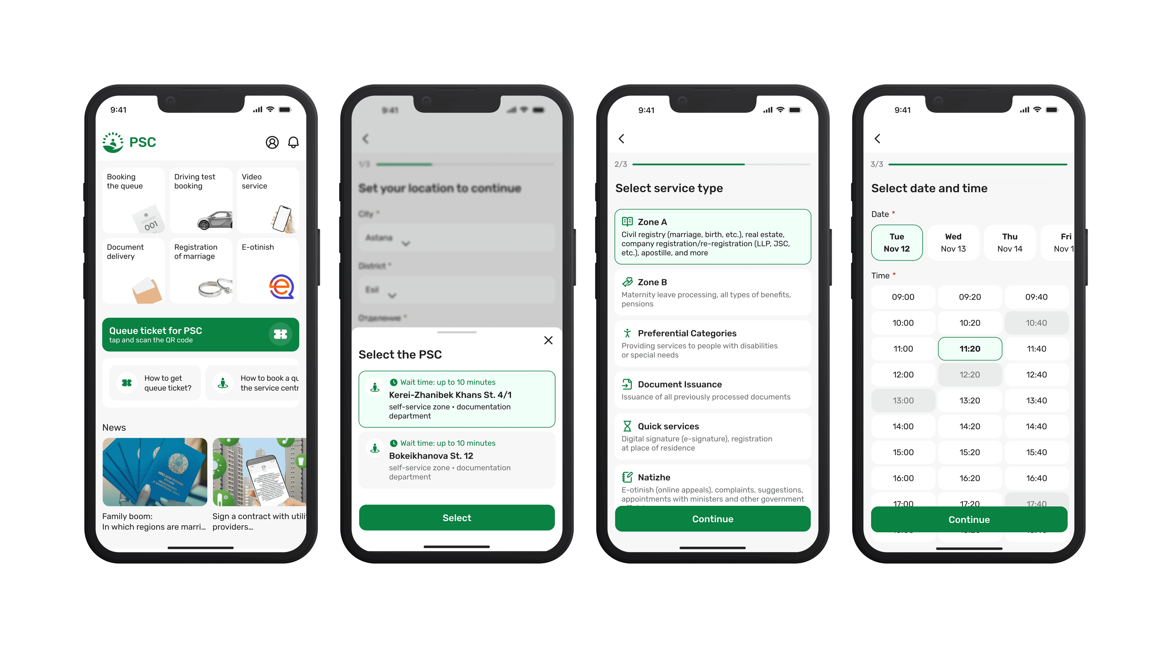
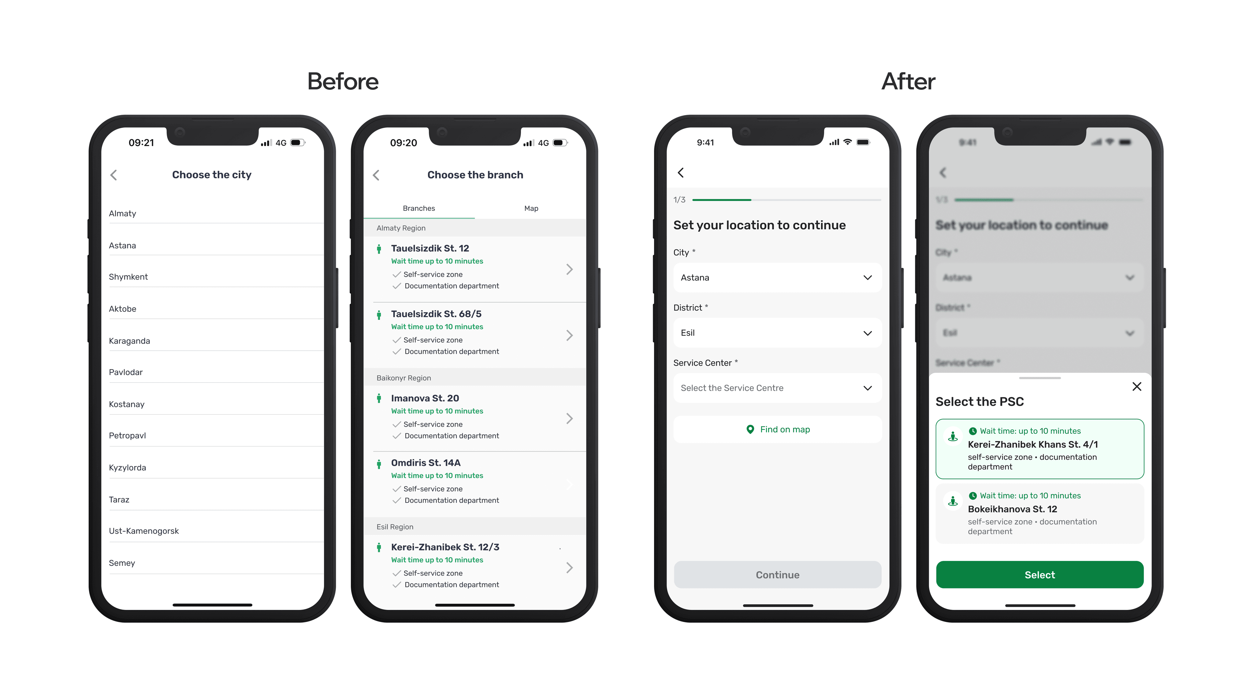
The original booking flow split city and branch selection across two separate screens, creating a disjointed experience that confused users about their progress.
I consolidated both city and branch selection into a single screen, adding a clear progress bar to help users understand where they are in the booking process and what steps remain.
Working closely with the frontend engineer, we implemented automatic city detection to speed up the process for most users, while maintaining manual selection options for those who need flexibility or are booking for different locations.
This consolidated approach reduced the number of steps in the flow while providing users with better context and control over their selections.
Design solutions:
Adding descriptions and error prevention
Design solutions:
Adding descriptions and error prevention
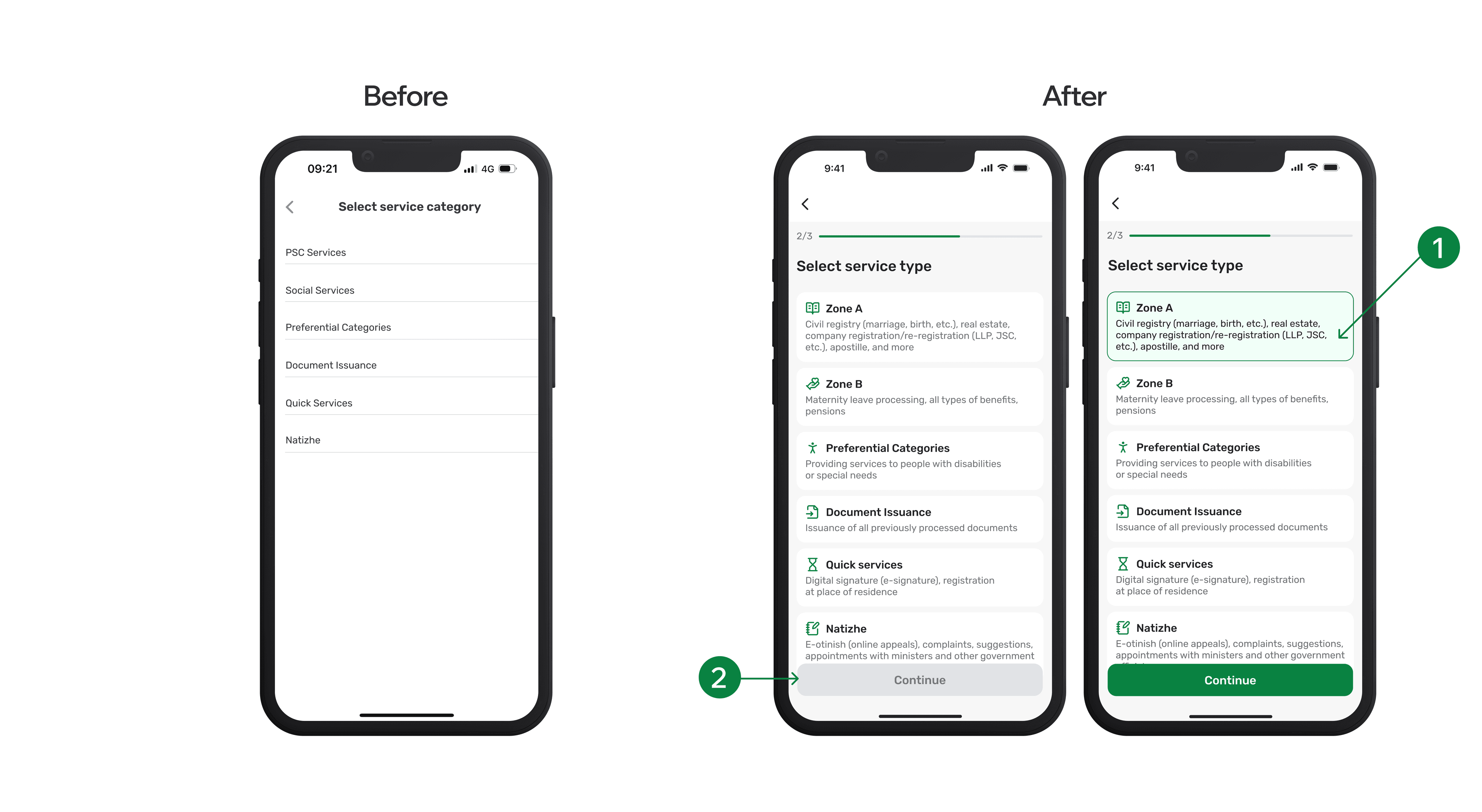
Earlier usability issues also revealed that the names of service types were confusing to regular users. To fix this, I added brief descriptions to each category and used a more consistent, accessible layout.
To reduce errors, the “Continue” button remains inactive until a service type is selected, helping users stay on track.
Design solutions:
Adding descriptions and error prevention
Design solutions:
Adding descriptions and error prevention
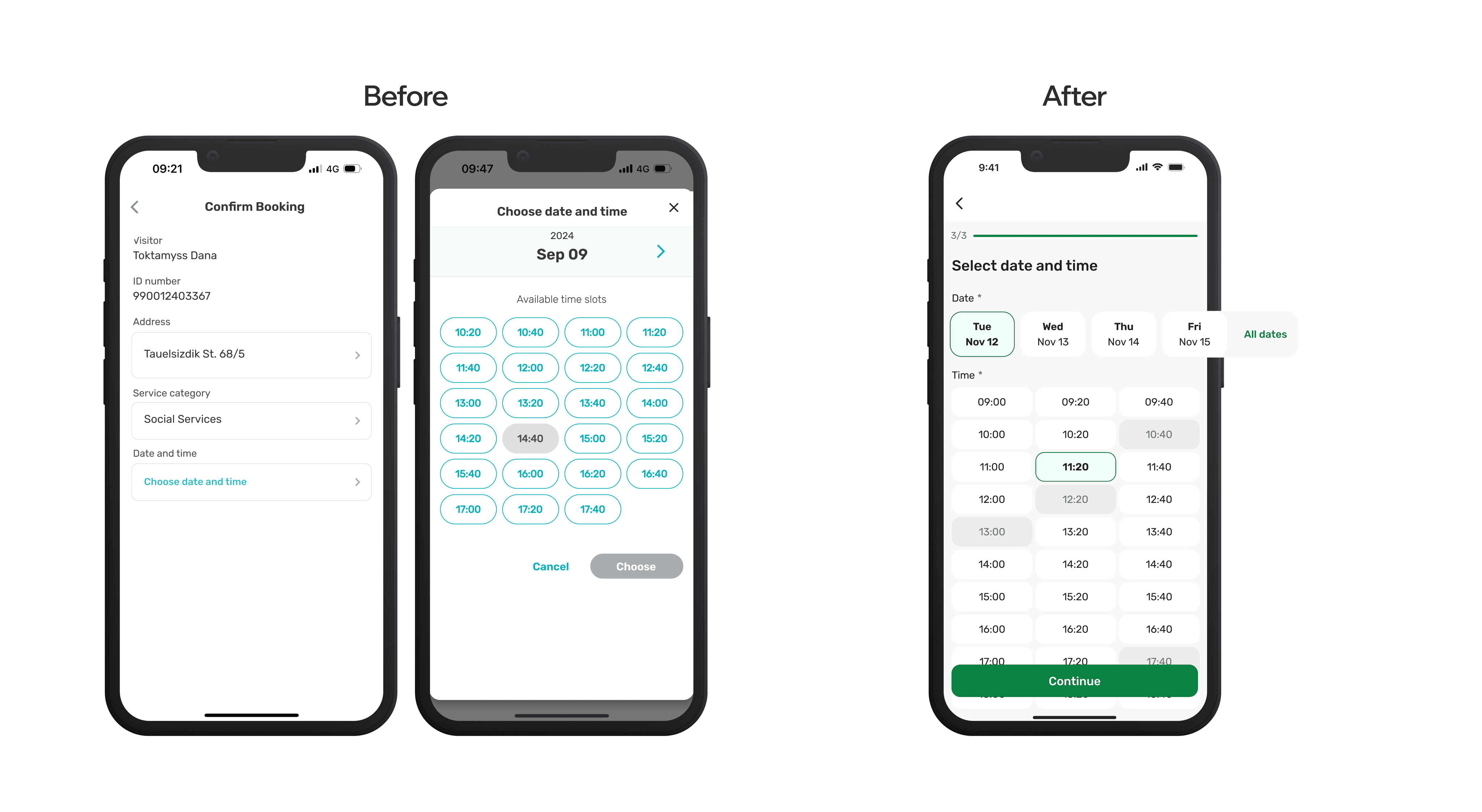
The next problem appeared on the “Confirm Booking” screen. After choosing a service, users were unexpectedly directed to a page where they had to manually tap “Choose date and time.” This broke the flow and was unclear. I replaced this step with a new screen that directly shows available dates and times.
Following best practices, I prioritized the nearest available options while keeping other dates accessible.
Design solutions:
Final touches
Design solutions:
Final touches
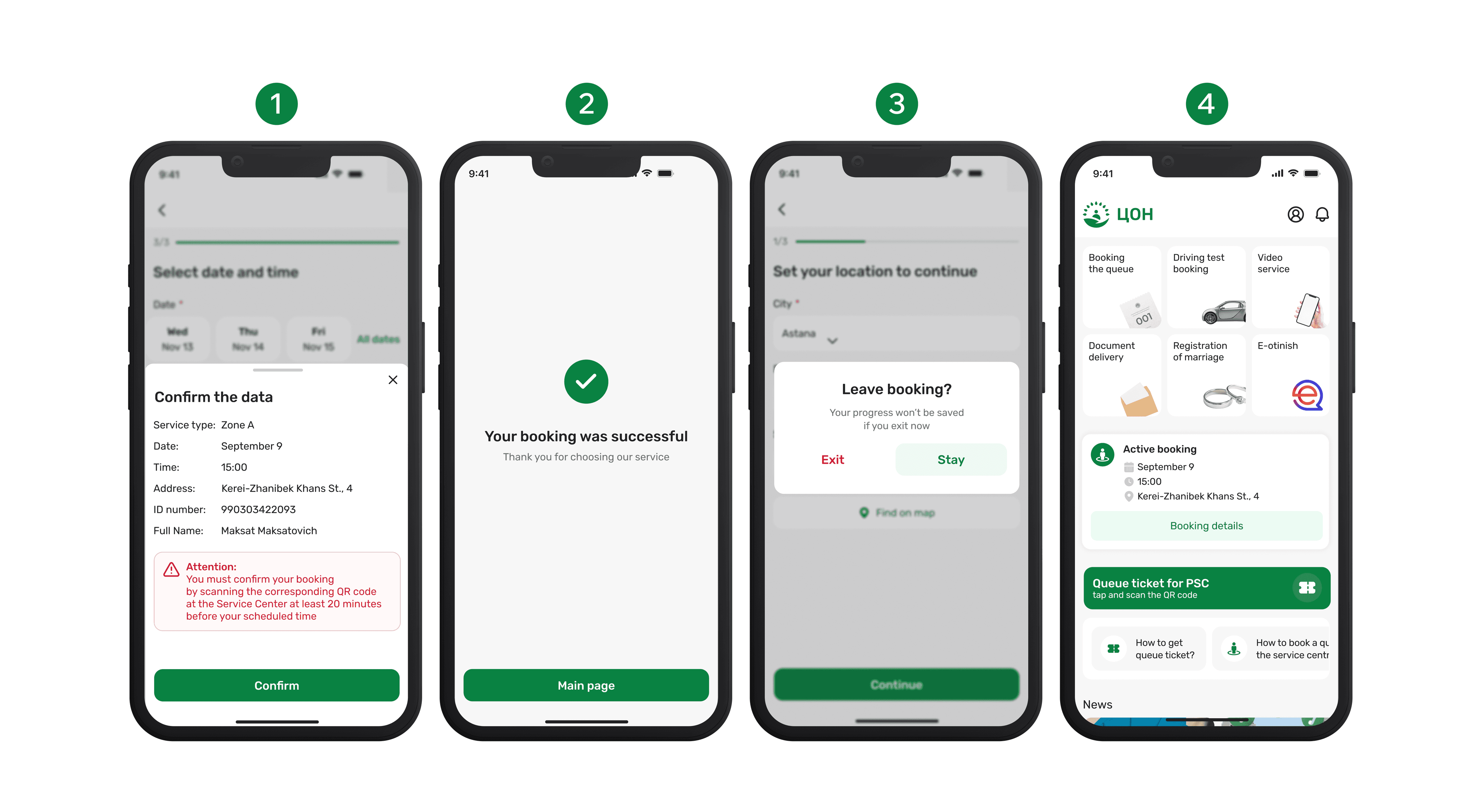
Finally, to make the experience feel complete and polished, I added four key touchpoints that support the overall flow:
Confirmation step — Allows users to double-check details like service type, date, and personal info before finalizing. This step builds trust and helps prevent errors.
Success screen — Provides a simple confirmation message with a thank-you note, giving users a sense of closure and confidence that their booking went through.
Error prevention dialog — If users try to exit mid-booking, they get a warning about losing progress. This prevents accidental exits and user frustration.
Active booking widget — Displays the user’s current booking on the homepage with date, time, and location. This reduces uncertainty and makes information easy to access.
Implementation & Handoff
Implementation & Handoff
Once the final screens were designed, I walked the developer through the flow to ensure alignment on logic, interactions, and functionality. We discussed edge cases, transitions, and what changes were necessary in the current structure.
Although we didn’t conduct user testing on the new version before implementation, I validated the key decisions through internal feedback (guerrilla testing) and a discussion with the front office representative earlier in the process.
After getting approval from the project lead, I handed off all screens and assets for development. During the development phase, I stayed closely involved, reviewing builds, testing flows alongside the team, and providing iterative feedback to fine-tune spacing, component behaviors, and copy.
Reflection
Reflection
In conclusion, if I had more time, I would have conducted user interviews to better validate assumptions and refine the design decisions. I’m also aware that skipping usability testing isn’t ideal, it’s a key step to ensure the improvements truly meet user needs.
Still, this project allowed me to practice fast, user-focused decision-making within real constraints, and strengthened my ability to deliver thoughtful solutions under pressure.
Got questions or just want to say hi?
Feel free to get in touch, I’d love to hear from you!
Let’s create something great together.
Got questions or just want to say hi?
Feel free to get in touch, I’d love to hear from you!
Let’s create something great together.
Got questions or just want to say hi?
Feel free to get in touch, I’d love to hear from you!
Let’s create something great together.